Footwear Parent Company
Corporate identities need not be dry. As the parent company of footwear brands Cobb Hill, Aravon and Dunham, the Drydock Footwear Group needed a neutral look while still capturing their hip yet down-to-earth corporate culture. Soapbox set the tone with the throwback of manila and diner mugs, contemporary typography and a matter-of-fact palette. The website showcased their carefully furnished industrial setting, painting the picture of life at Drydock for partners, prospective employees and the media.
Biotech
Some companies really do set out to change the world. For Generation Bio, the most critical ingredient to the future of genetic medicine is an inspired, thoughtful commitment to their company culture. Emerging from the sea of typical biotech communications, Soapbox worked closely with the leadership team to bring to life their core values with total authenticity through a company “creed” and detailed handbook full of poignant photography and plain speaking copy.
Every internal touchpoint at Generation Bio is worthy of thoughtful composition — clean designs, meaningful imagery, copy that connects — always balancing the day-to-day matters with the shared mission of redefining genetic medicine to serve patients who would otherwise struggle with genetic disease for their lifetime, and to preserve wellness for generations to come.
Copywriter — Amy Flanagan
Private School
As part of a comprehensive marketing effort to reveal one of the Monadnock region’s best kept secrets — Waldorf education — Soapbox created a website loaded with imagery of the daily goings-on, a walk through the grades, and proof-in-the-pudding content like alumni stories, news articles and testimonials.
The logo was updated to emphasize MWS’ strong academic program while the overall brand look and feel features experiential photography, textures and palette that bring to life Waldorf’s creativity, harmonious values and connection with nature.
Comfort Footwear
Story coming soon!
Art Director — Sandi Quatrale
Copywriter — Amy Flanagan
Running Footwear & Apparel
Even a tech-focused trade catalog can be infused with the reinvigorated Saucony brand. Clean, consistent information design kept this catalog the functional reference tool it needed to be, while showcasing the Saucony lifestyle reinforced the brand and its customers to the very ambassadors Saucony relies on most — its sales representatives and retailers.
Fresh off a new logo design, Saucony needed to revamp packaging, hang tags, business cards and more. We used the Saucony “bird” as a primary design element to capitalize on the iconic quality of the mark. Motion and optimism carry the packaging with a dynamic tone-on-tone red palette coupled with the clean, technical tones of white and grey to present a sophisticated yet welcoming brand image.
Art Director — Sandi Quatrale
Copywriter — Amy Flanagan
Women's Comfort Footwear
It’s not very often that a footwear brand starts from scratch, but such was the genesis of Cobb Hill by New Balance. Soapbox crafted a quirky, colorful, down-to-earth fashion brand full of independent spirit, through photography, voice, packaging, advertising, point-of-sale, web presence, social media, collateral, broadcast and promotions. The Cobb Hill business grew rapidly — beloved by consumers and retailers alike — so much so that its parent company acquired Rockport in 2015 with Cobb Hill as the major driver to revitalize the Rockport women’s business.
Art Director — Sandi Quatrale
Copywriter — Allison Juves
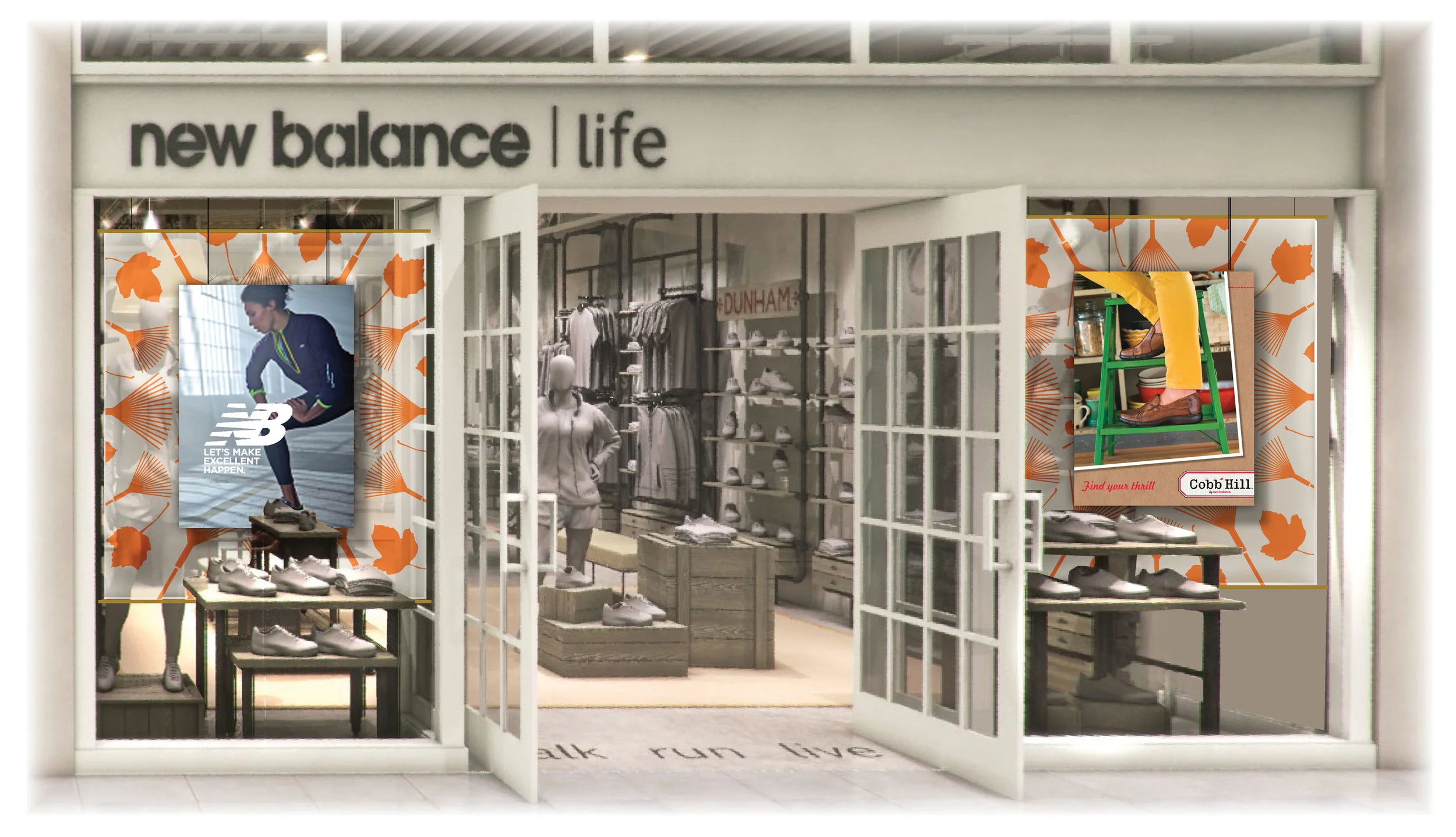
Footwear & Apparel Retailer
In an effort to bring New Balance into the lifestyle market in a more powerful way, a flagship retail store was launched at the Burlington Mall in Massachusetts. This store would showcase New Balance’s casual and retro styles and their comfort casual brands Cobb Hill, Aravon and Dunham. We created the launch package to establish the in-store graphic look-and-feel as well as the overall tone and personality for retail promotions.
Art Director — Sandi Quatrale
Copywriter — DeMane Davis
Men’s Comfort Footwear
Story coming soon!
Art Director — Sandi Quatrale
Director & Copywriter — DeMane Davis
Escape (Travel Magazine)
Escape was a seasonal custom publication sent to travel savvy American Express card members. It features an upscale mix of enticing editorial content, exclusive partner offers and timely travel tips. Tasked with the publication’s redesign in 2008, Soapbox revamped the photography, design and production quality with a modern editorial style that made Escape not just a well-targeted marketing tool but a magazine worthy of the coffee table.
Agency : ISM Travel & Leisure Marketing
Luxury Ecological Resort
Months before this resort destination was ready to be photographed, we introduced the beautiful Mayakoba to celebrities and the press by painting the picture of harmony, nature and culture that is the legend of “living Mayakoba.” Even we were impressed by the response and learned just how powerful and compelling the vision of Mayakoba was — we had created demand without a single photo of the actual resort!
This logo and identity system captures the unique promise of “living Mayakoba” — an invitation to relax in luxury, enveloped by the mysterious beauty, quiet adventure and natural tranquility of the exotic Mayan Riviera.
Agency : ISM Travel & Leisure Marketing
Software & Technology
It was time to shed the engineering startup look and firmly brand ECM as a software and technology company. Soapbox met this challenge with a masculine palette, stylized industry imagery and backdrop circuit board graphics alongside ECM’s application renderings. Simplified copy, an icon system to break out key advantages and a strong form-based call to action brought attention and confidence to this innovative player in the electric motor space.
Mover Segment Marketing
Story coming soon!
Art Director — Sandi Quatrale
Copywriter — Amy Flanagan
Editor — Ellen Wallet Lacey
Municipal Recreation Department
In the brand-name town of Concord, Massachusetts, even the recreation department recognizes the benefit of a strong brand as it finds itself increasingly competing with private sector organizations. We packaged their aquatic center, preschool, camps and more with an energized, unified design that has just enough flexibility to customize messaging and imagery for the varied audiences served — from moms and toddlers to students and seniors. A pattern of municipal-style stick figures provides a fun design element that embraces their municipal roots with humble humor and an approachable passion for the active lifestyle.
Organic Soynut Butter
This health food company needed a brand identity that would jump off the shelves and connect with both moms and kids looking for school-safe nut butters. An inquisitive tagline, unabashed primary palette and quirky characters celebrated the spirited simplicity of Simple Food across packaging, apparel, an eCommerce website and sales materials. When Simple Food exported to Asia, Dubai and the UK, the brand remained in tact, resonating on an international level.
Coffee Shop & Gallery
This passionate entrepreneur had a vision — local coffee, local food, local art. A gathering place. For friends, family, community. For what mattered. Soapbox brought to life this creative vibe with a colorful brand identity as inviting and delicious as the menu. Packaging with a variety of stickers, the look is flexible and inventive for the long term.
Art Director — Sandi Quatrale